NEXT PROJECT
INTRODUCTION:
website migration:vans korea (brand IDENTITY & activation) and vans korea e-com
wireframing
ui/ux
02 - 04
e-commerce Migration
wireframing
ui/ux
website migration:vans korea (brand IDENTITY & activation) and vans korea e-com

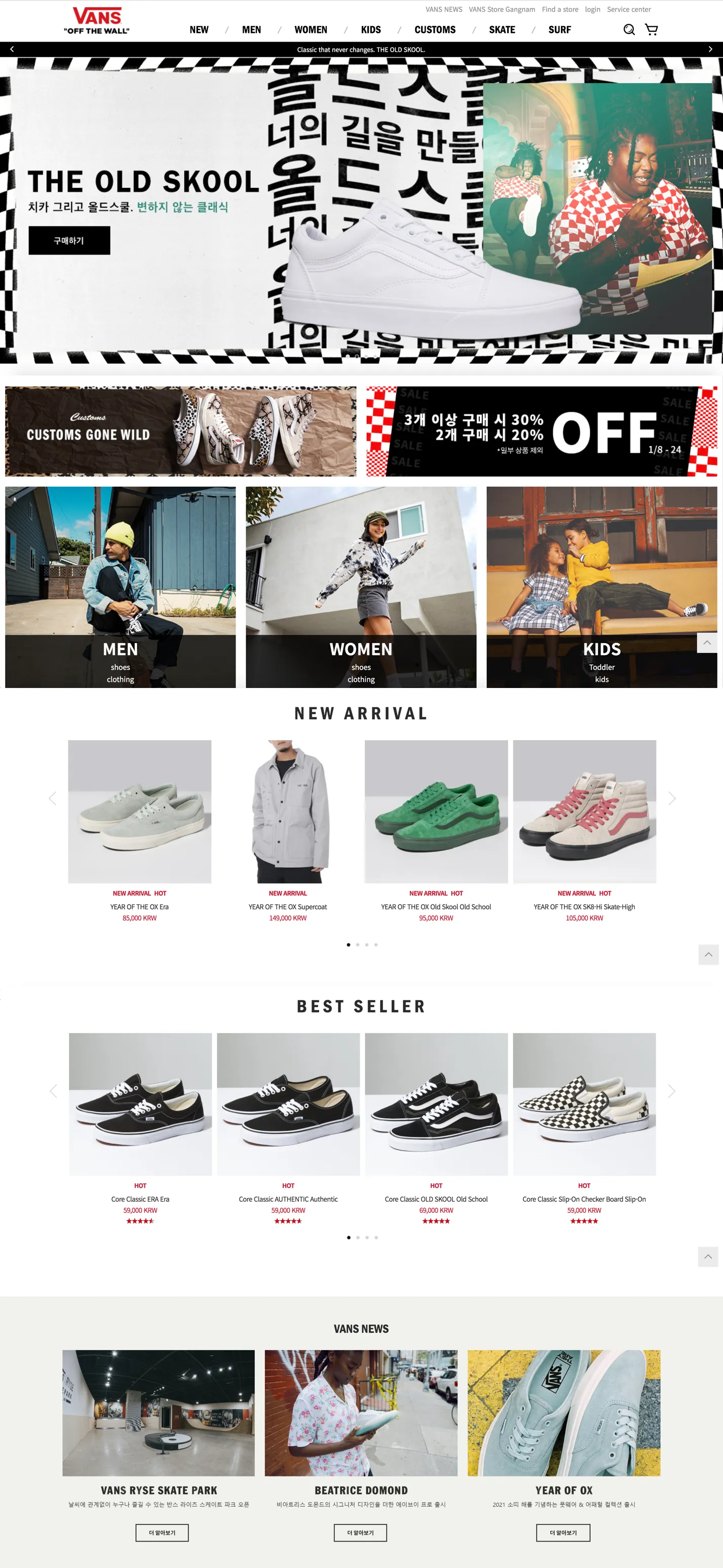
Here was a project to migrate two websites which are different aspects and functions. The Korea Hub is mainly focus on the brand and cultural aspect. Skateboarding news, brand activations, skater and artist showcase in website strengthen the relationship between local youth culture and Vans's "Off the Wall" value, in order to build a long-term advocacy. On the other hand, the E-Commerce website is separated from Hub, which is more directly to buy and sell products. However, this is different with the Global and South East Asia E-Commerce practice.


In the beginning, I was working closely with Korean Brand Communication team, APAC E-Commerce team and assisted the research studies to provide design solutions in order to fulfil the user needs, business challenges and Korean local market. At a later stage, starting with wireframing, sitemap and metric style guidelines for UI design, and communicated with Korean development agency to complete the whole site in mockups and for AB testing.
Customer/ user
need a way to
(Pain Point)
Directly purchase the desire product instead of redirect to different websites which is confused them during the journey.
New content and pages are hard to be categorised by stakeholders between two websites. Customers are unable to find the certain content, such as: skateboarding news, Vans activation and latest collaboration.
CHALLENGE
Increase the opportunity of dropping off.
Because of function overlapping, some contents are miscategorised in the navigation menu, even in websites.
Product Listing Page traffic account for 62% of total traffic. This is due to core source come from Naver display ad.

Research Finding
Product Listing Page accounts over 60% of total traffic. Customers mostly browse and stay between Product Listing Page and Product Detail Page back and forth.
High Bounce Rate of Product Listing Page.
No matter where the users' entry point (Product Detail Page, Content Page, Home), their 2nd step usually go to PLP.
Insight
The information/ CTA/ guidance in PDP is not sufficient enough to convince customer to take an action to check out flow.
Four columns product showcase is not attractive at all. Also, the filter section is not obvious enough. Besides, without relevant contents that keep users stay in the site.
Users are less likely going back to homepage, meaning that top navigation bar and navigation menu help to identify the right Product and Content in certain extent.
1. Discard the overlapped content between two websites but also consider to add new functions
2. Improve the user experience of PLP and PDP
3. Improve the the existing navigation bar and navigation menu

Despite of the Naver display ad led users land on PLP greatly, I see it is important to direct users to PLP, so flows to PLP were funneled from Content Pages (for example: News Detail Page, Skateboarding Page).

For Typography, Global provided a standard guideline in English. Considering the Korean market, I decided to develop a set of reference styleguide (text in buttons, forms and product badges) in Korean for developers. So the wireframes in English that I designed can easily switch to other language without changing their interfaces. Also, there are icons for Korean social media and specialized functions in a regional website.


One of the purposes of migration is to reinforce the brand communication in a E-Commerce. For UI elements, there are several sections (News section and Recommended Products section) that appear frequently in different pages, designed a responsive elements for PC and mobile to increase interactions between product showcase and news media.
